Our relationship with Te Wānanga o Aotearoa (TWoA) started in 2015, with a review of their brand identity. We were tasked with creating a strong, relevant and accessible brand that defined their compelling, distinctive and uniquely Aotearoa story.
The brand identity was to communicate the vision to tauira, kaimahi and wider New Zealand: whanau transformation through education, aspiring to the collective success of tauira, their whanau and communities.
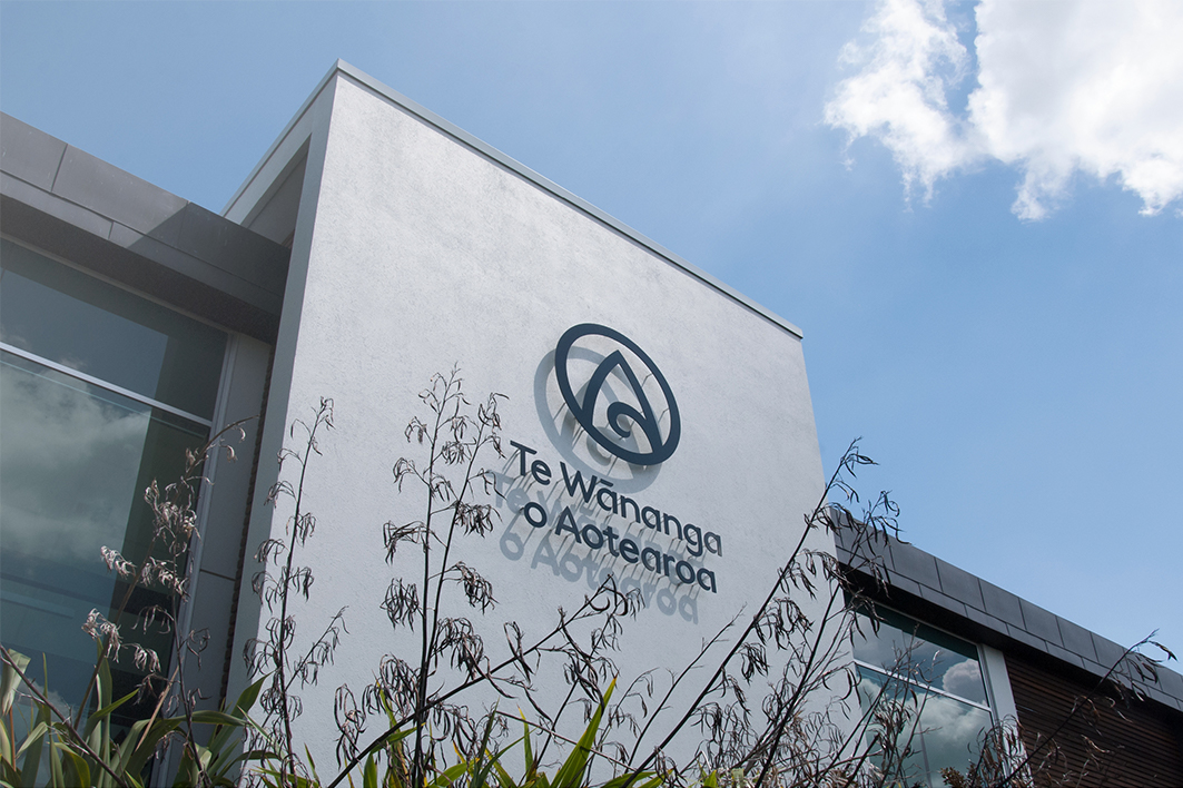
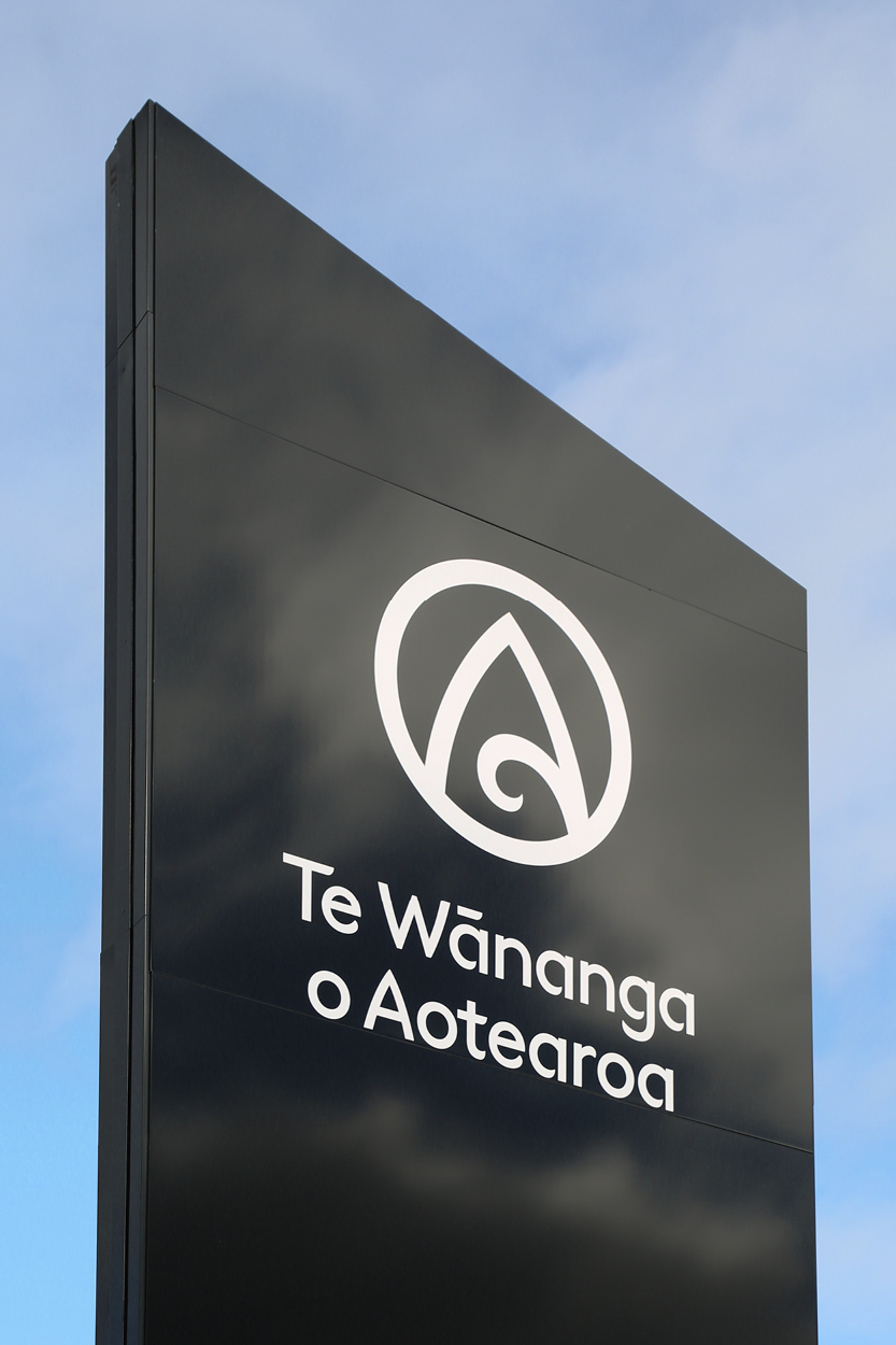
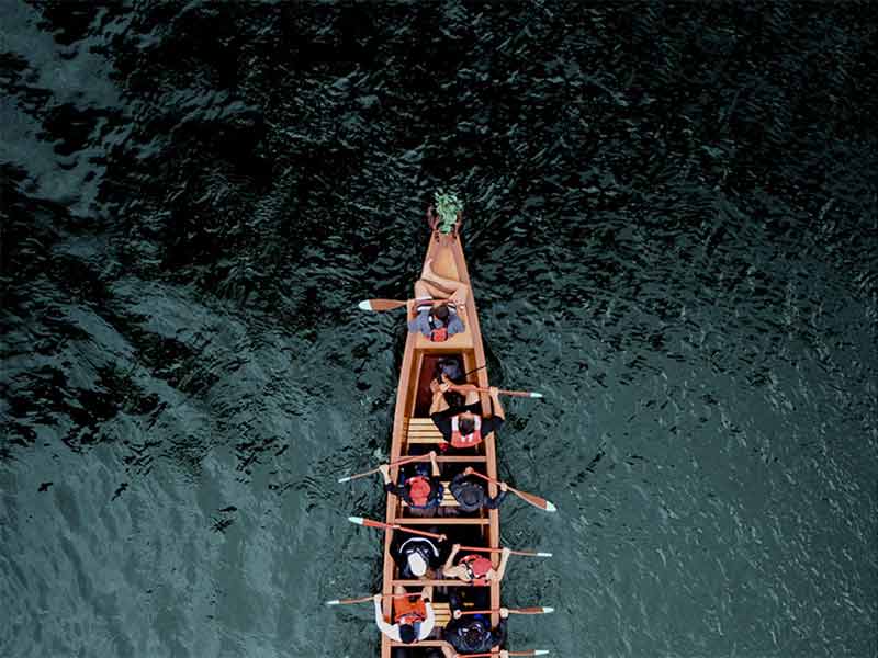
The Tohu (symbol) was refined by progressing the existing tohu design into a highly stylised aerial view of the waka, giving a whole new perspective. The sense of journey, together, is represented by virtue of looking inside the waka to the people within.
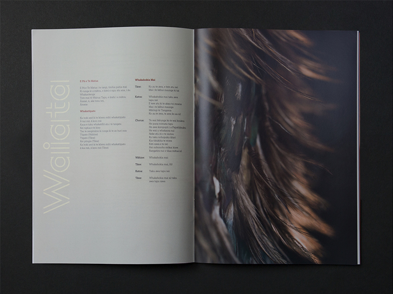
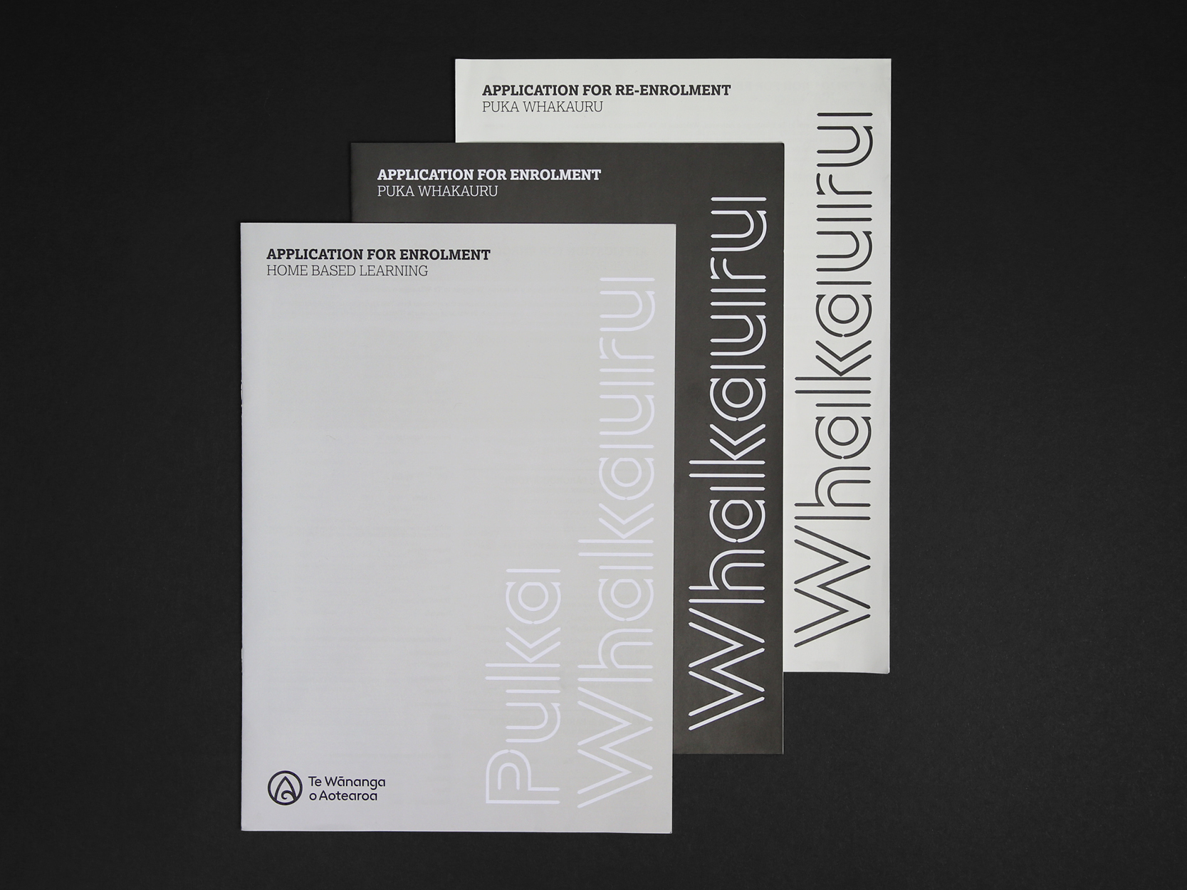
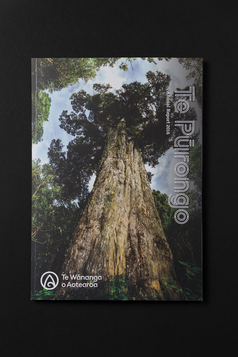
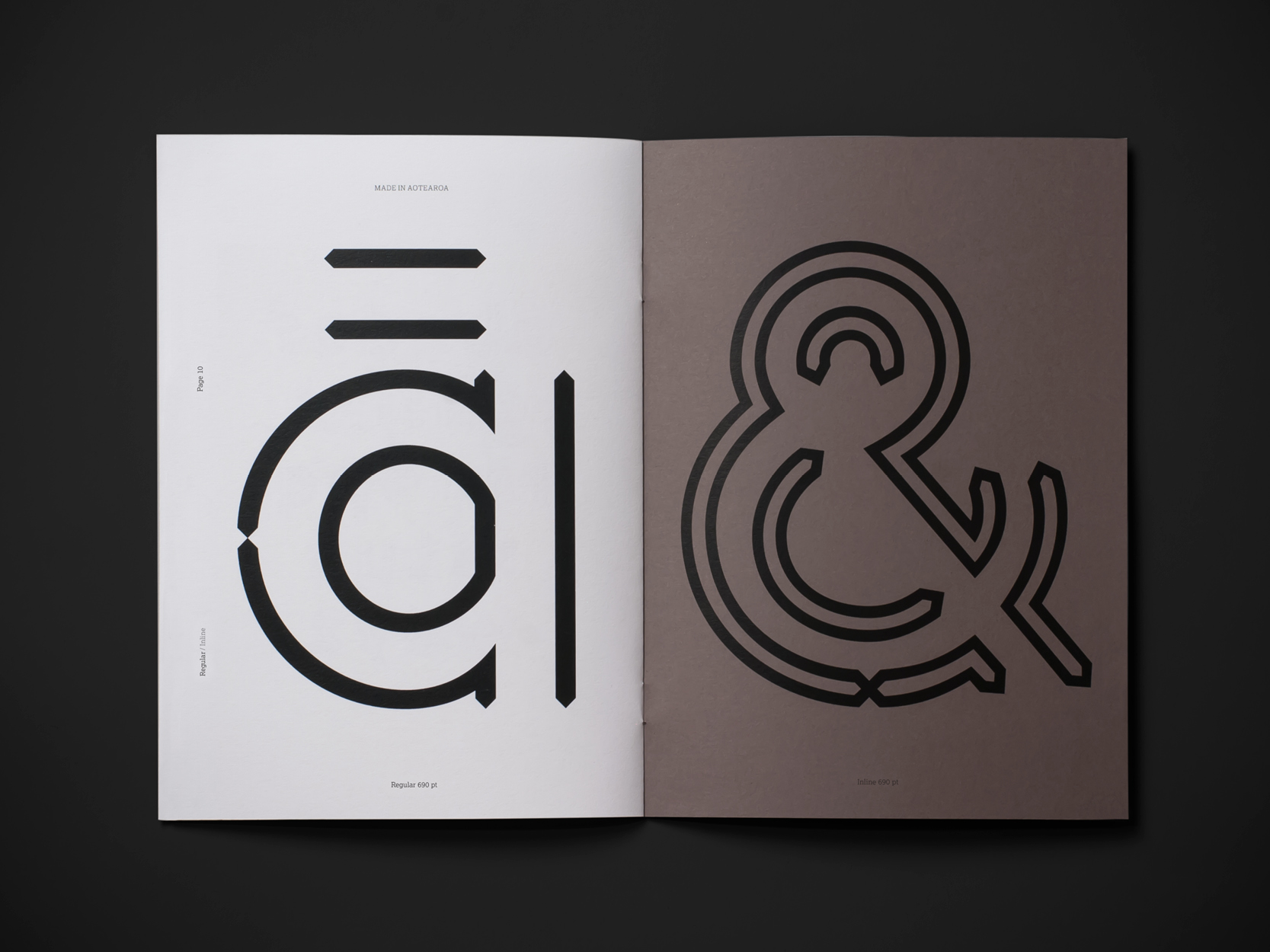
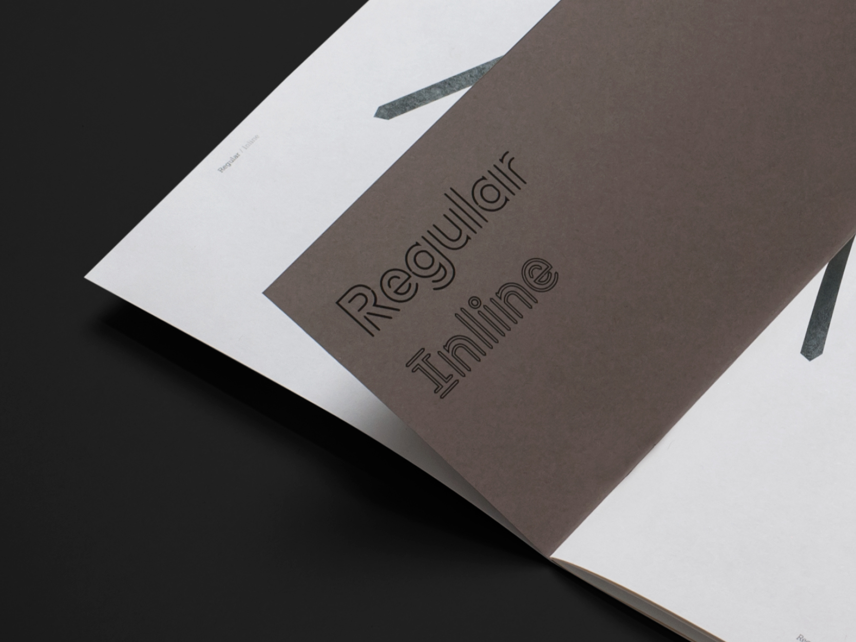
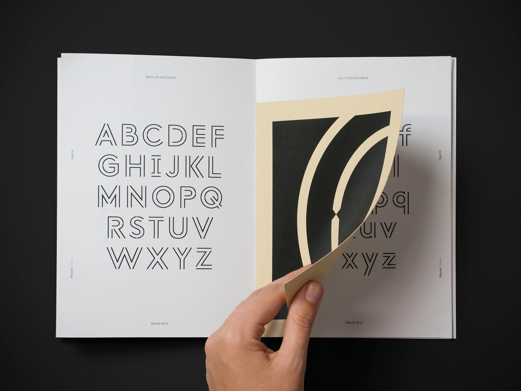
Along with the logo and wordmark, we created a bespoke typeface "Uhi" which mimics the chiseled angles of the mark-making process of tā moko and speaks of the history, culture and sacred identity of the Māori people, giving it a uniquely Maori feel while still being readable and distinct.
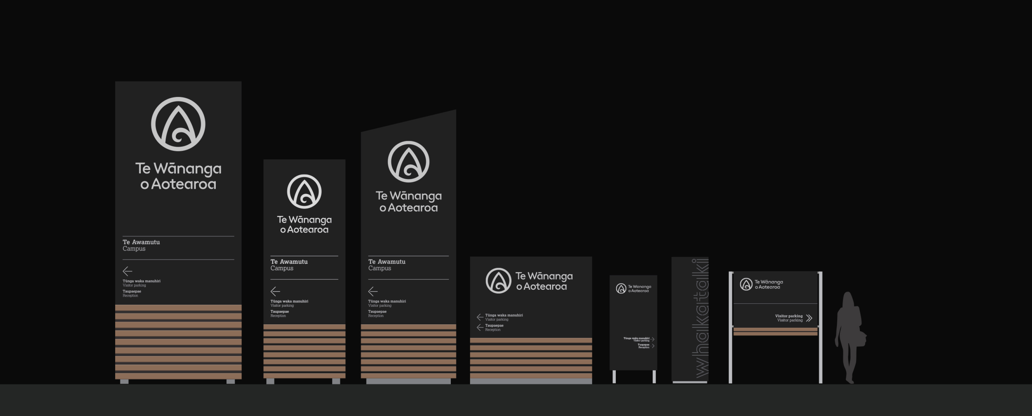
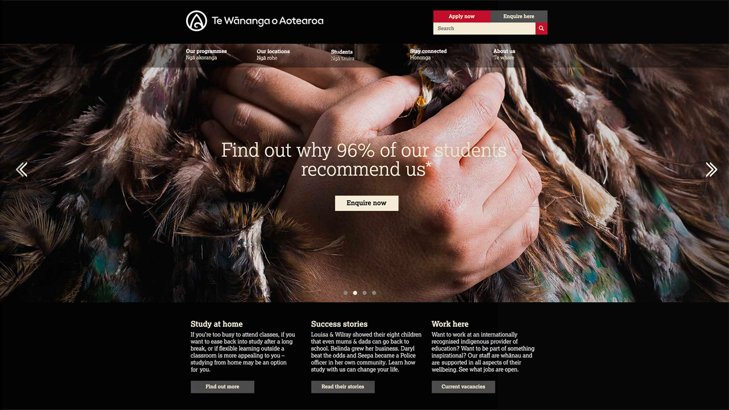
A vast array of collateral, from corporate documents through to web and signage has since been created in partnership with Te Wānanga o Aotearoa delivering a truly world class, welcoming, confident identity. One that is fitting for inspiring tauira and their whānau to explore and grow their potential.



“We needed a design partner who could complement our cultural competency, traditional design approach and innate passion with structure, technical professionalism and high-end execution experience. Thankfully, iceberg delivered on all of the above.
—
Hone Paul
Tumukahuroa, Executive Director Marketing„
