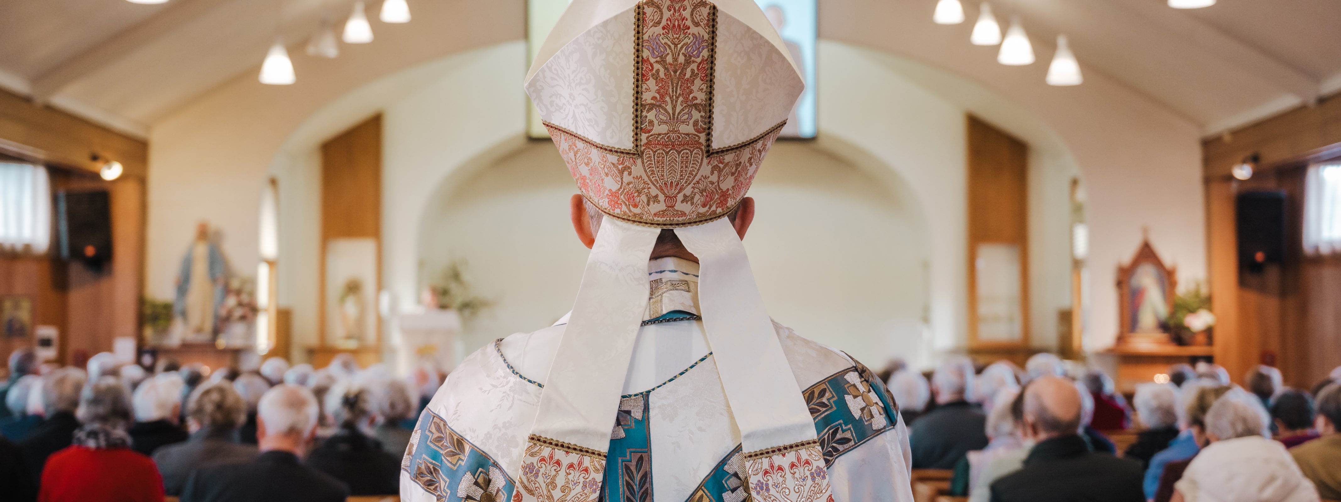
The Catholic Diocese of Christchurch is made up of many different agencies and organisations all working under the Bishop to strengthen and support their community.
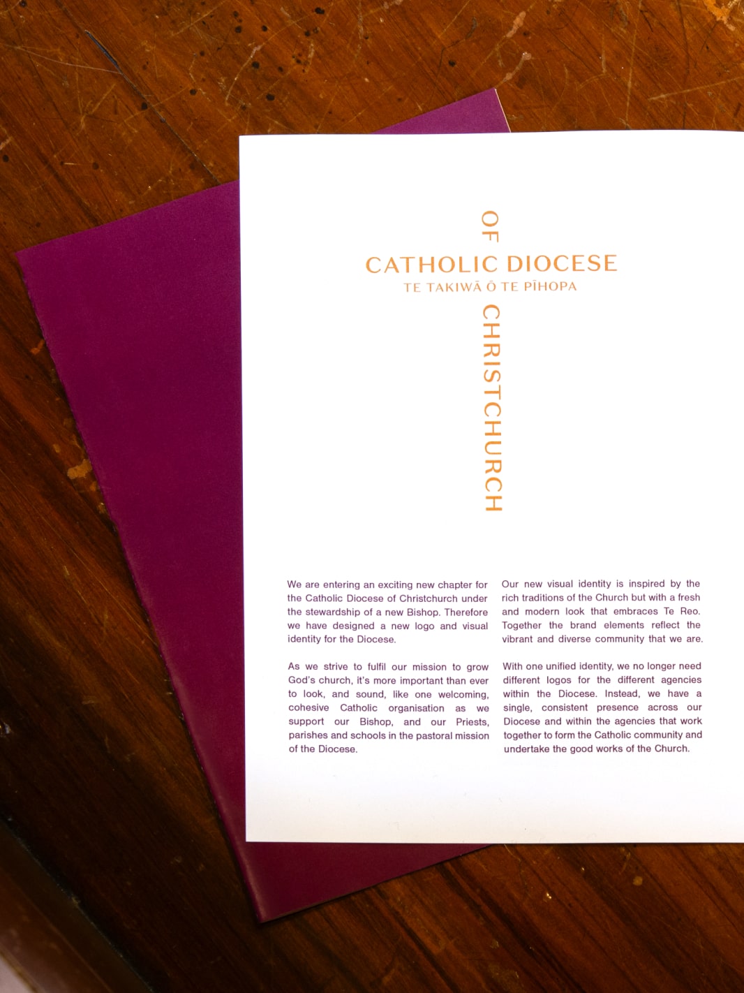
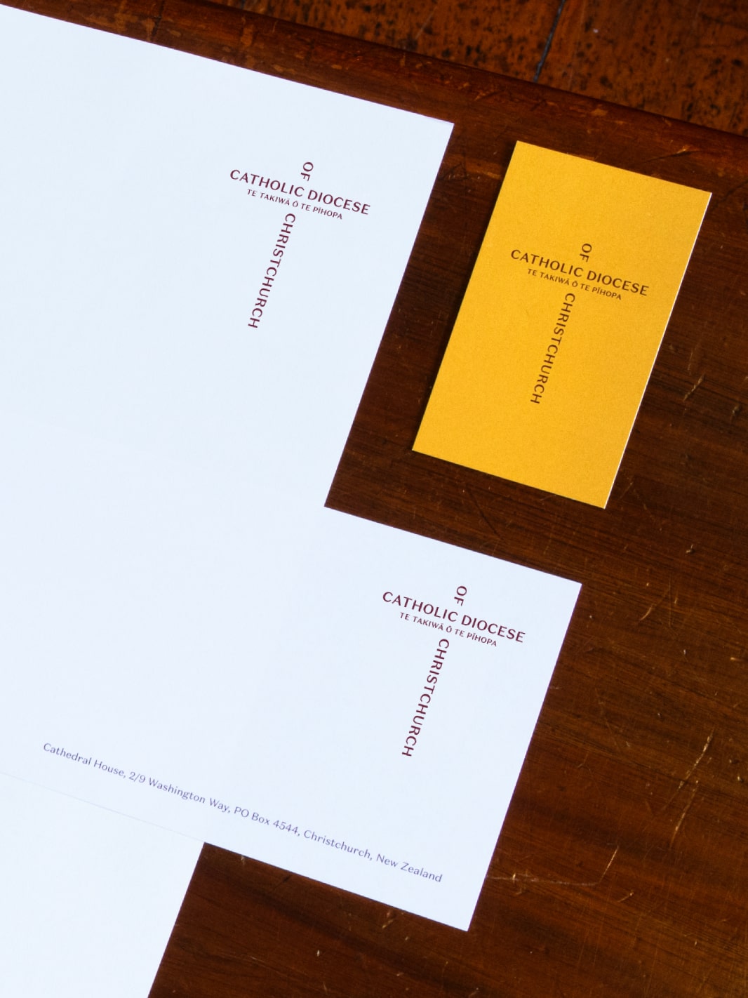
Over the years, this had led to half a dozen wildly different logos being used in the organisation. Needless to say, this was less than ideal and a rationalisation was needed to ensure the organisation spoke with one unified voice and prevented confusion for the public.
We conducted a workshop with church leadership where we reviewed the analytics on the previous website, conducted persona exercises to help understand our users and sketched potential user-journeys.
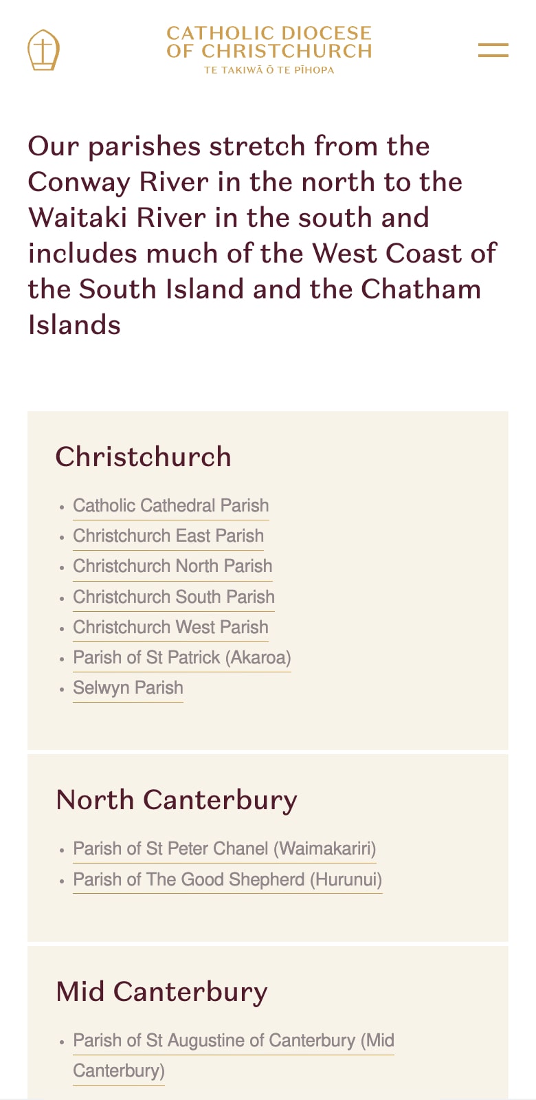
The final product features an intuitive search feature to help users find parish and church details quickly. And since it is built with a system of flexible blocks, it allows the Diocese team to create dozens of different layouts so the website can grow and adapt as they do.
Visit cdoc.nz
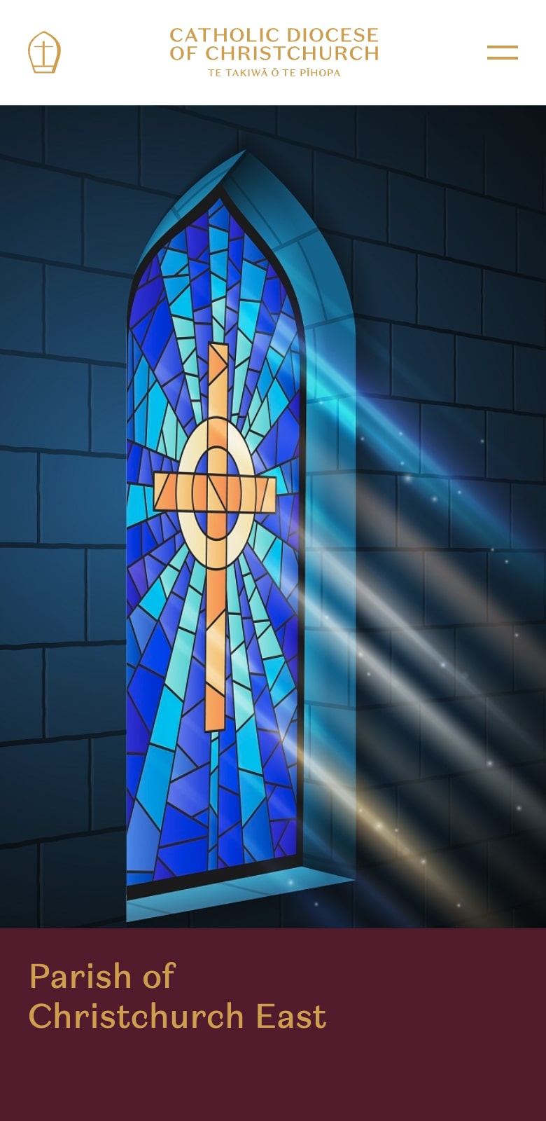
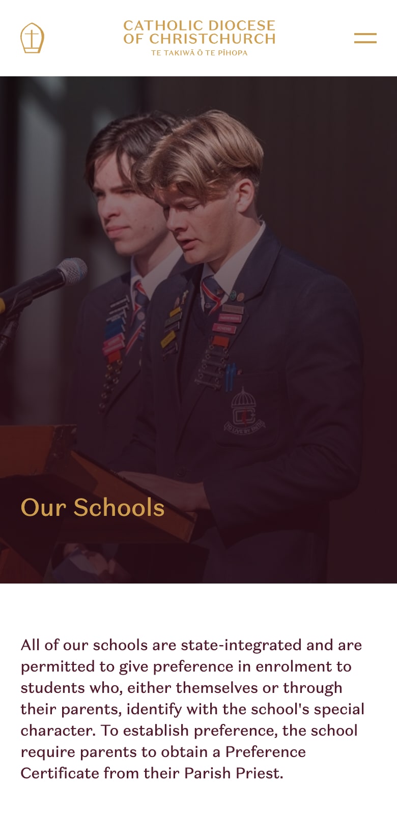
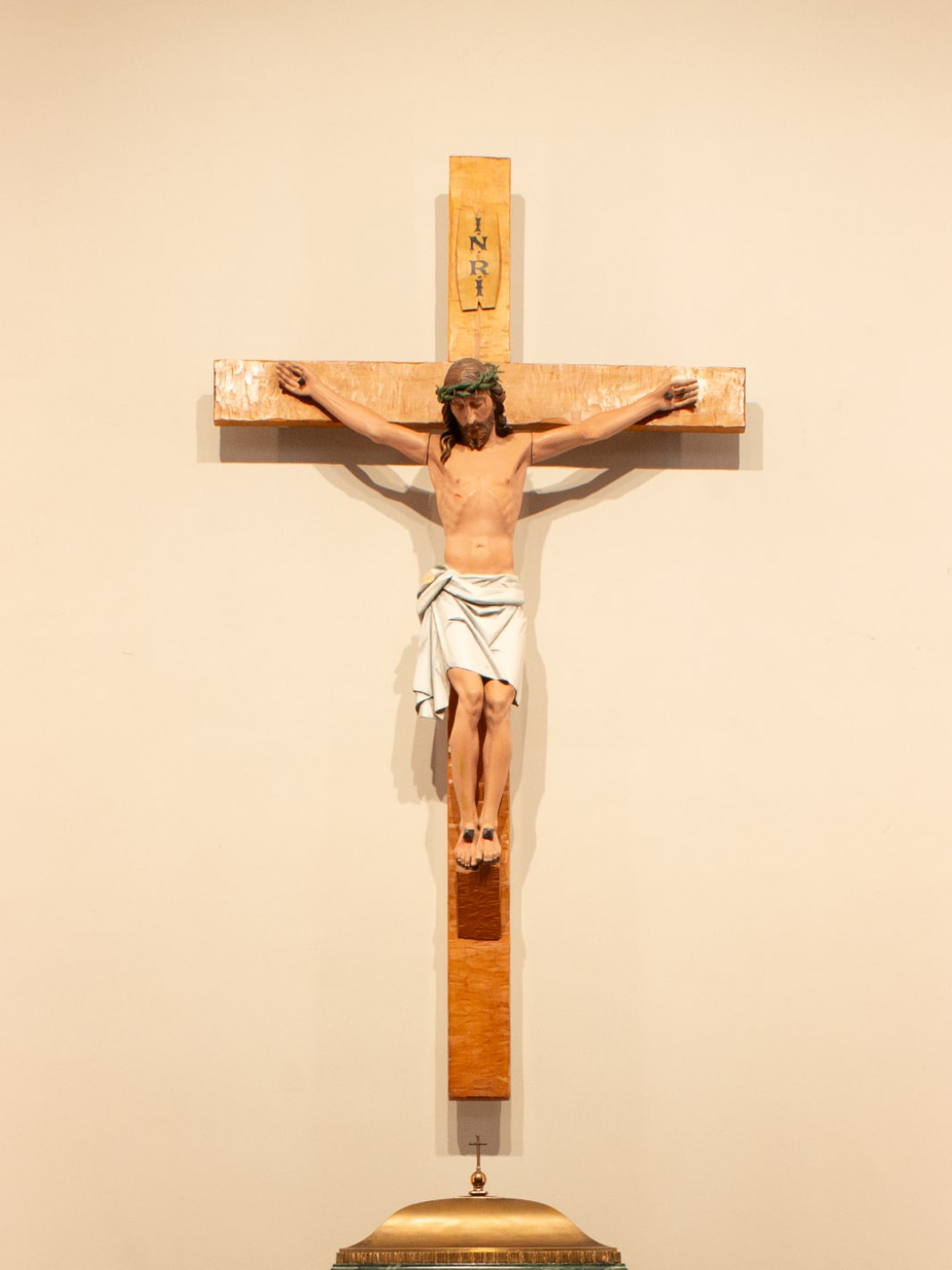
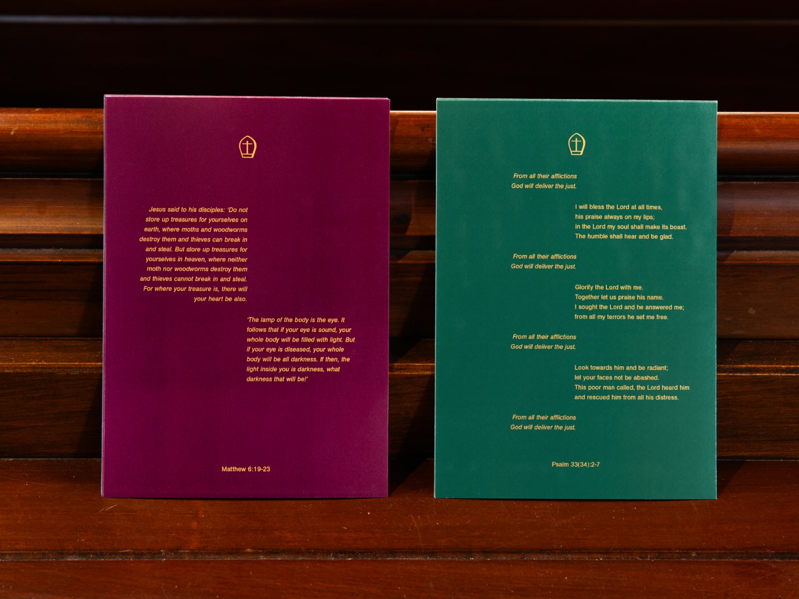
The approach was to tread lightly; to respect the church as a place of peace and quiet reflection and focus on a few key graphic elements, like the logo, typeface, and colour and keep the design to a minimum. The colour scheme was chosen because of its direct connection with the physical space.
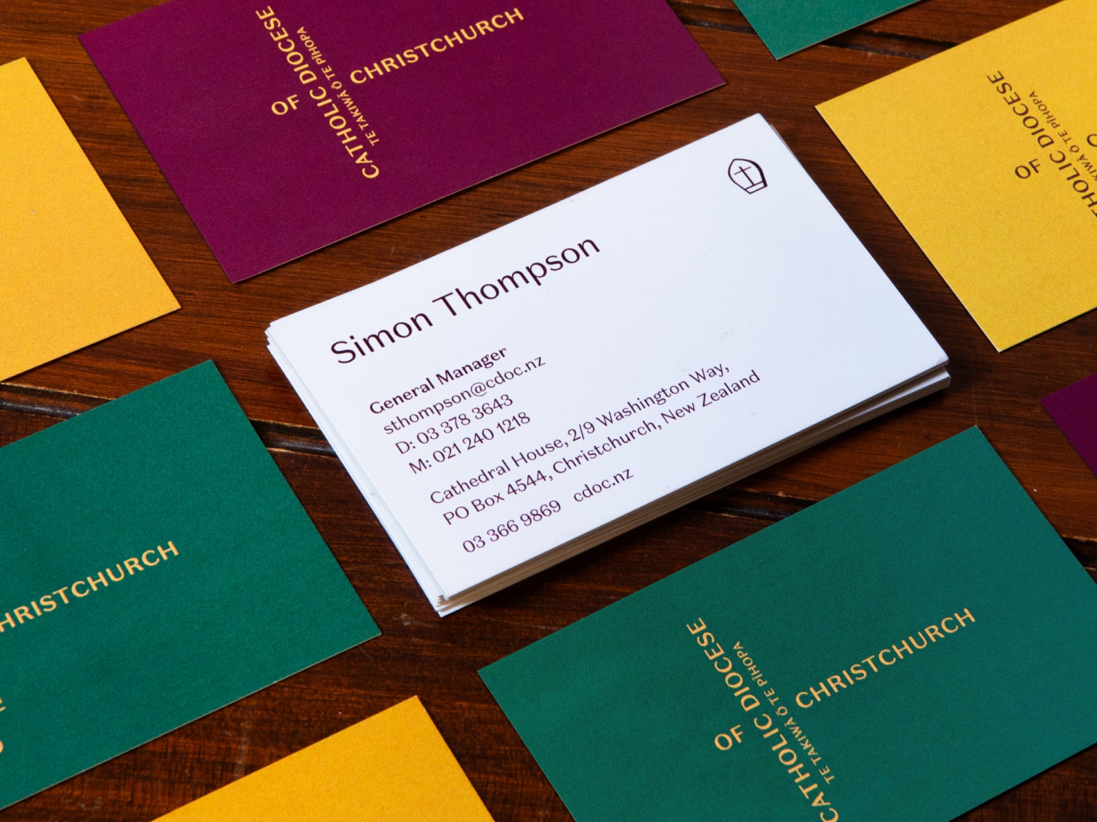
Mass is at the centre of the Catholic faith so the brand reflects that experience. Walk into any Catholic Church outside of Chrstmas and Easter time and you will see a church adorned in rich green, gold and crimson.
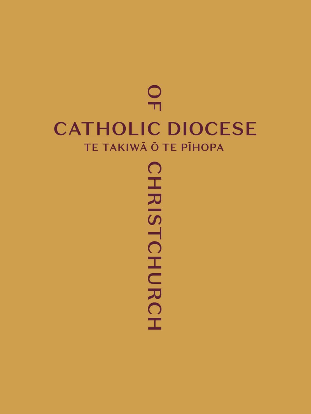
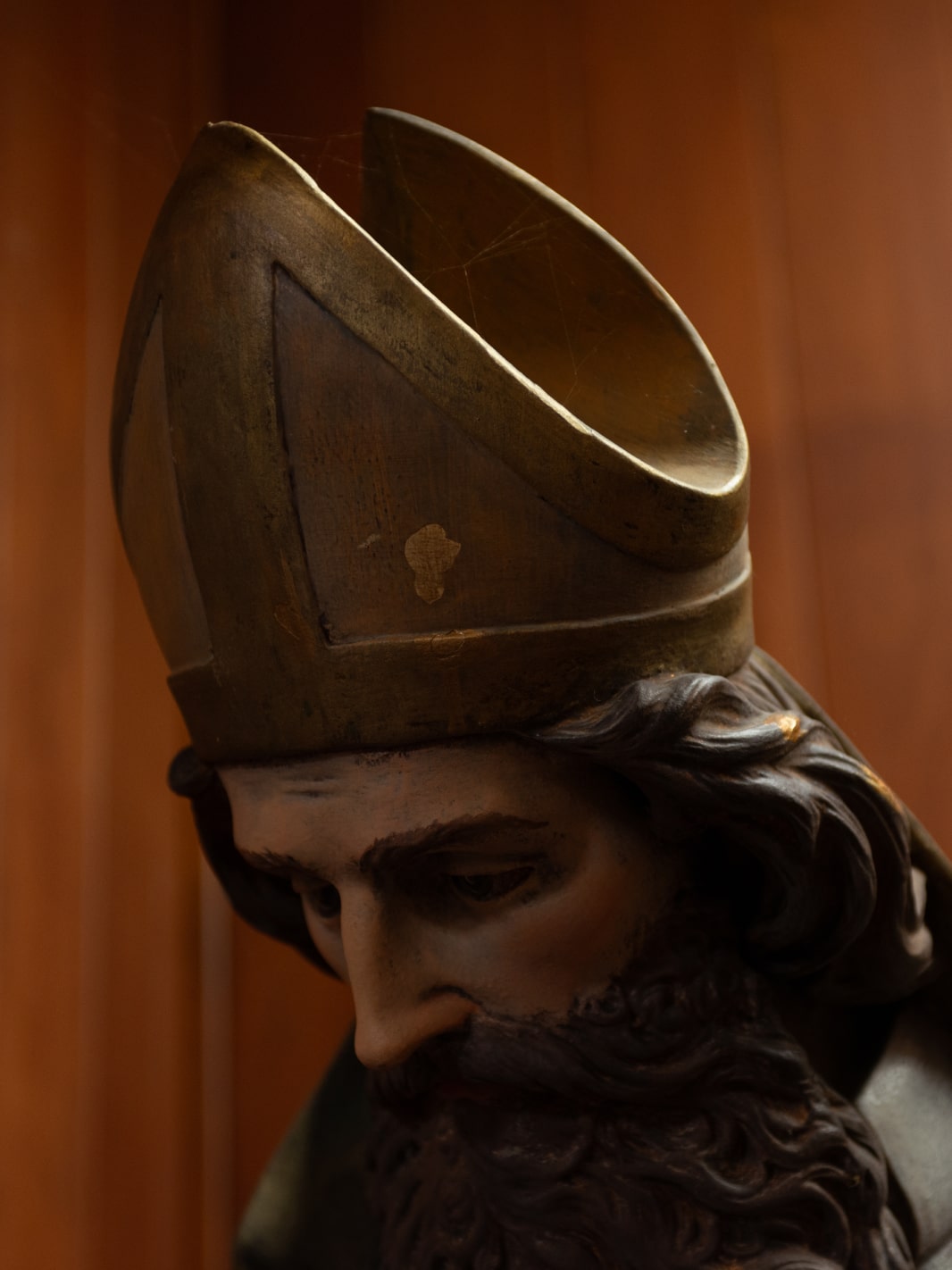
Te Takiwā ō Te Pīhopa as seen in the logo translates as “The realm of the Bishop”. The Bishop is the head of the Diocese and his leadership is represented through the iconography of his triangular headpiece known as a “mitre”.
