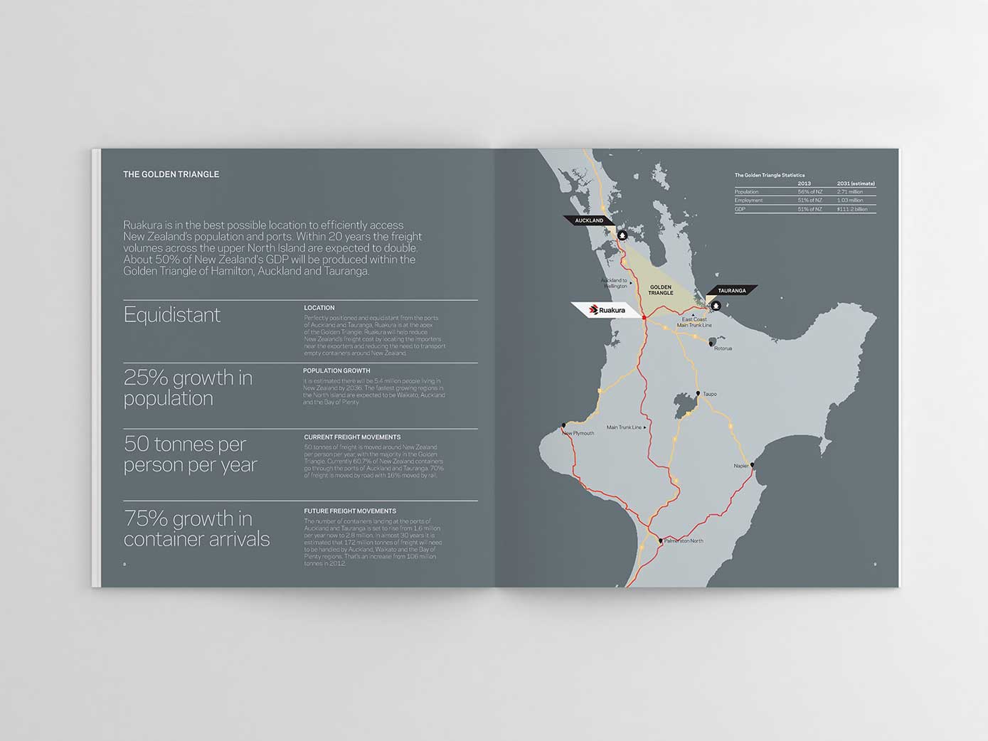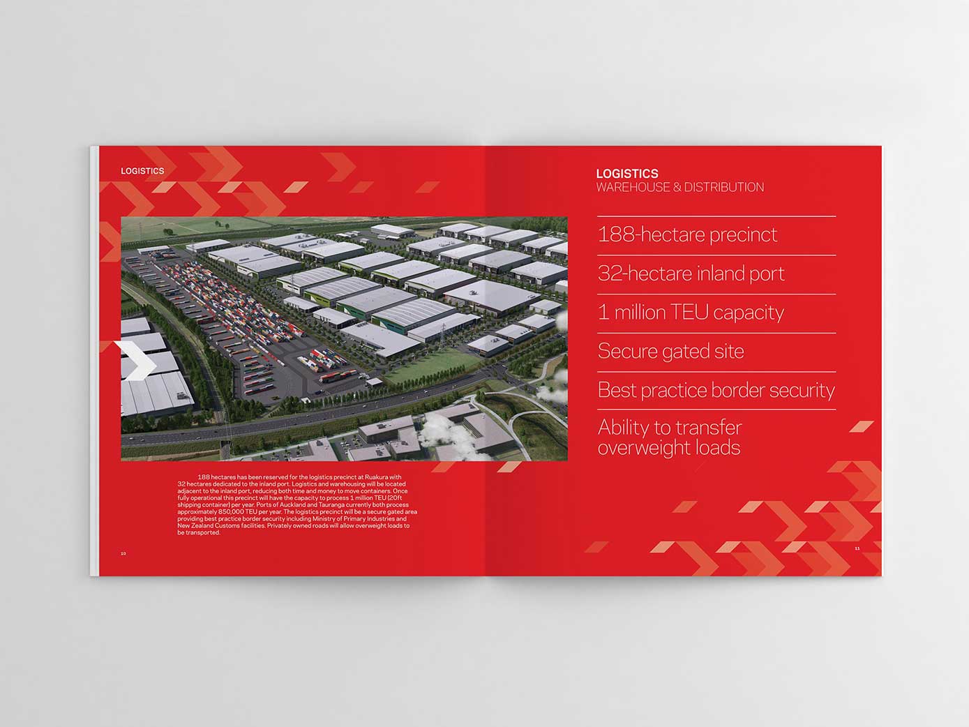
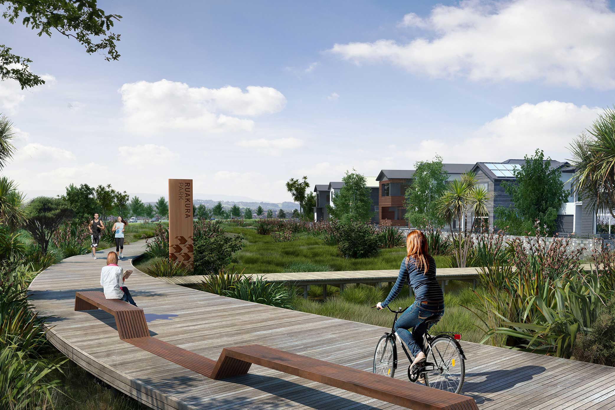
Situated in the heart of the Waikato is Ruakura. Planned out to 2061, and on a site larger than the Auckland CBD, Ruakura is the largest integrated masterplanned development underway in New Zealand; a port and logistics hub, a knowledge centre, a commercial hub and lifestyle development.
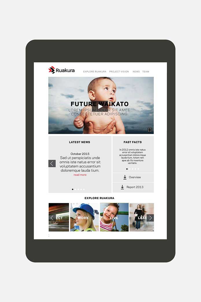
We were briefed by developer, Tainui Group Holdings, to create the brand strategy and visual identity for Ruakura. Behind the development is the idea that Ruakura will ‘rethink’ the way we have traditionally done things—unlocking potential.
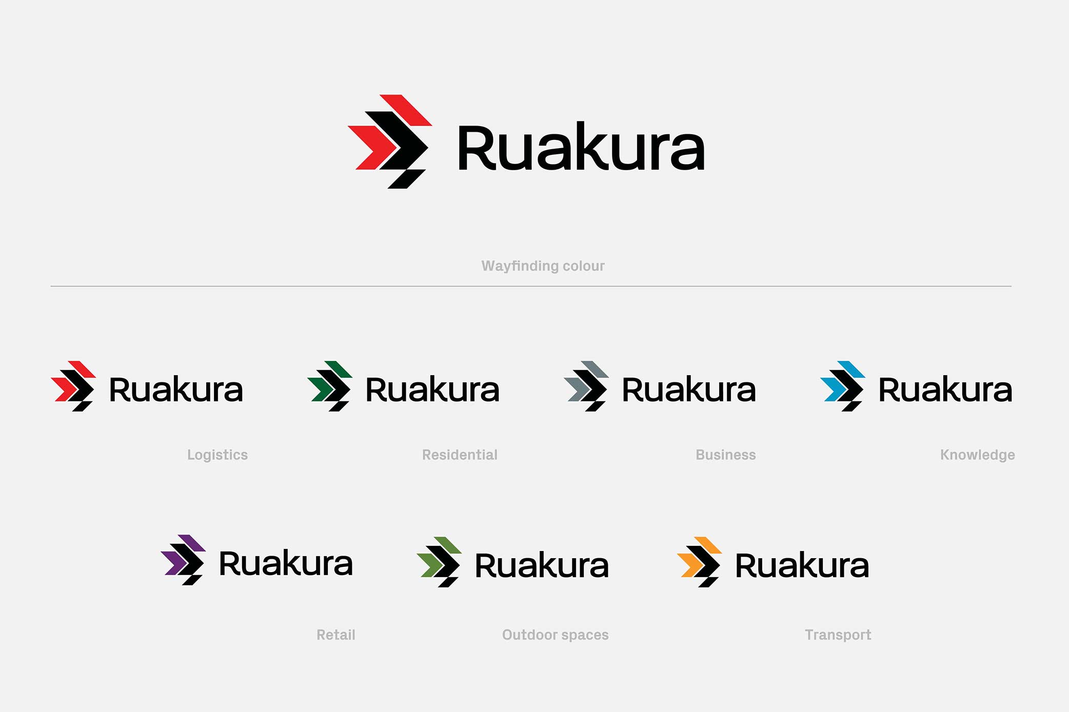
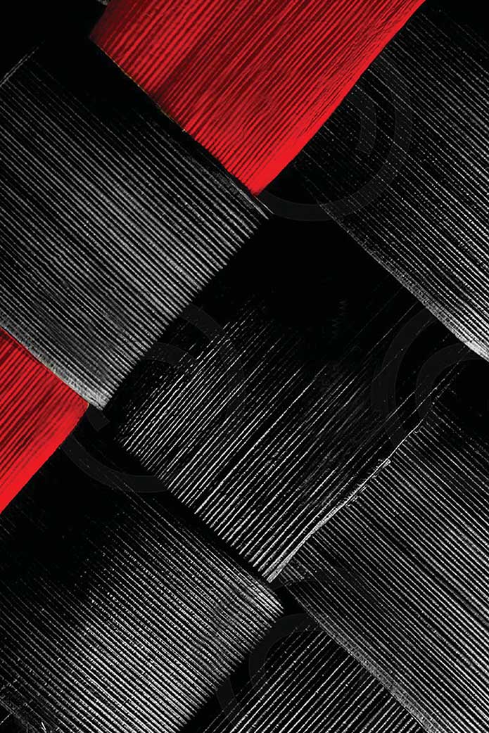
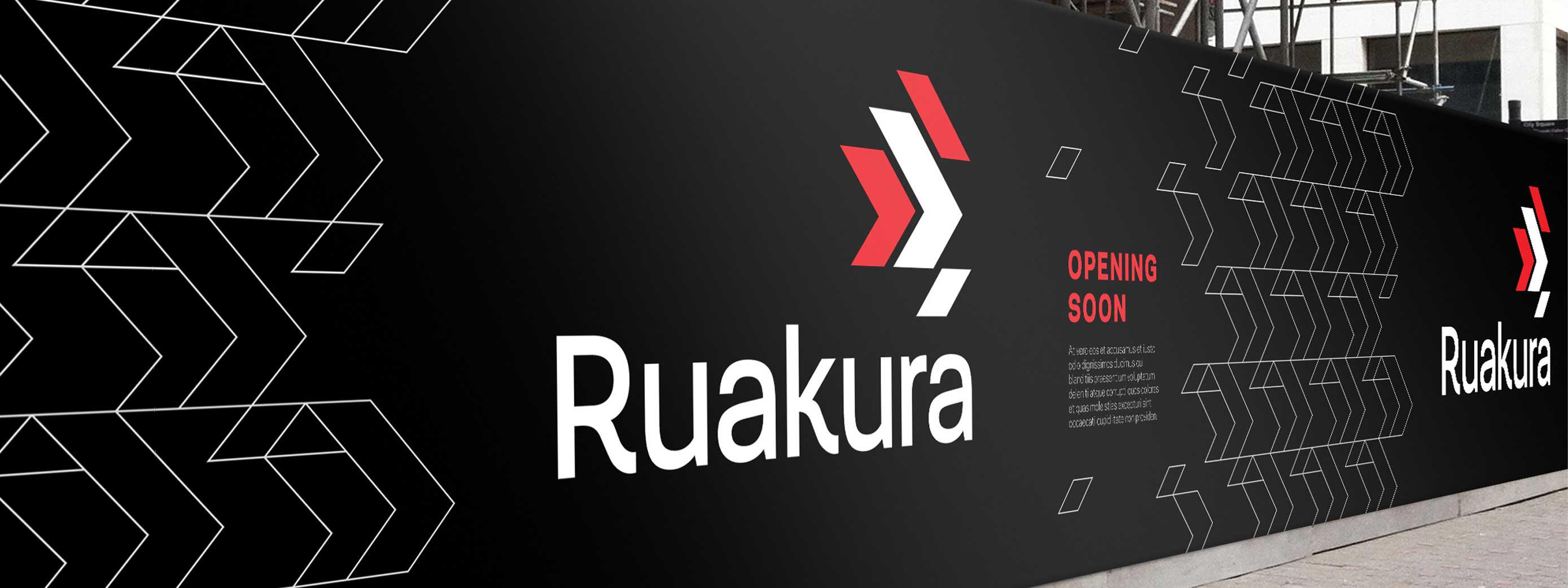
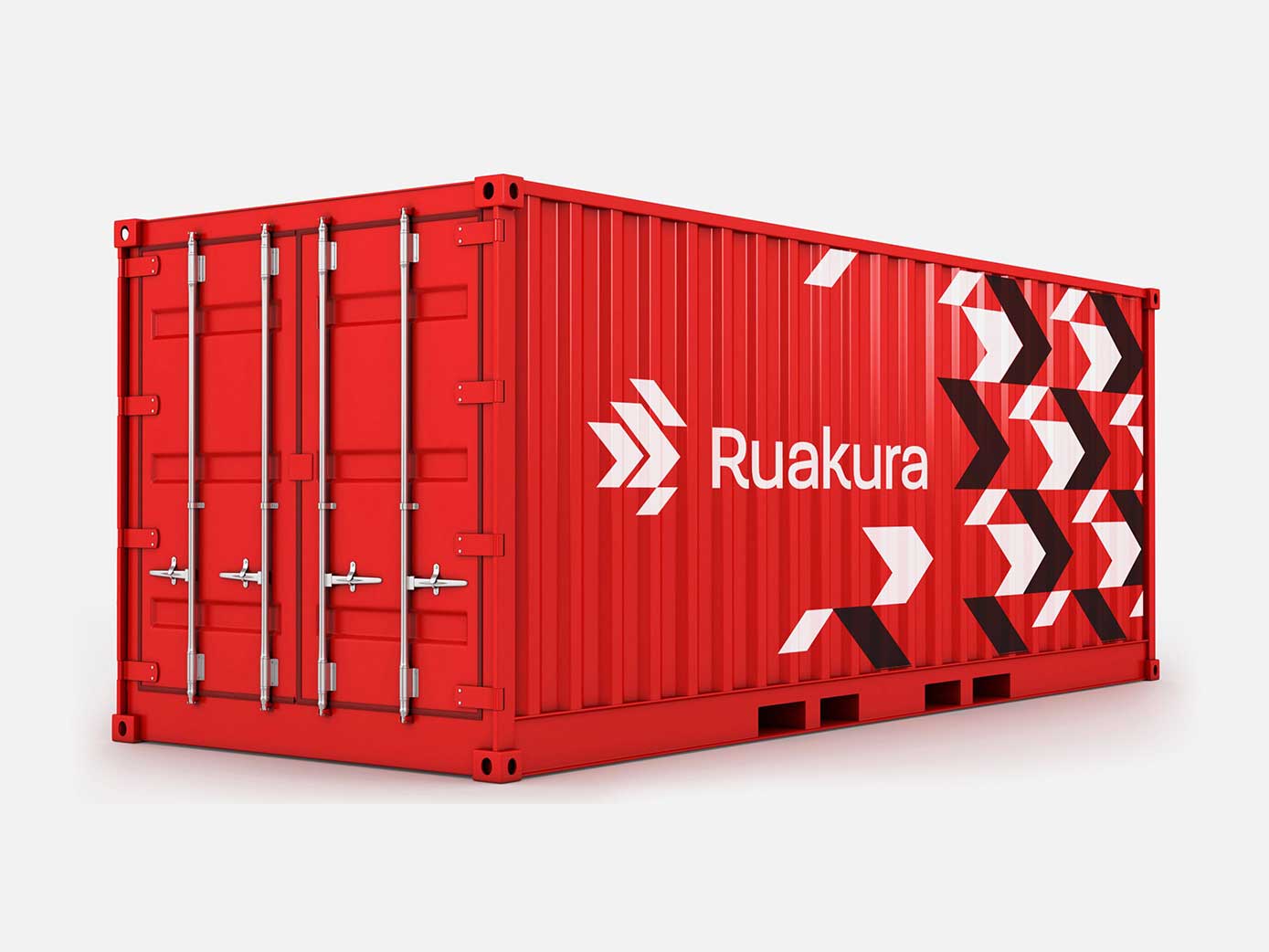
Central to the brandmark is a key symbol and wordmark that brings this idea to life. The creative has purposely been built on a foundation of cultural symbolism with strong commercial intent. The contemporary key symbol is derived from a Māori weave pattern, referencing the multiple elements; economical, social, cultural, political, environmental, commercial and technological that make up the Ruakura proposition. The graphic weave pattern is extended to make up a further element of the visual language. Translated, Rukaura means red pit, which in-turn informs the primary brand colour.

“We have always been impressed with the people and creative work of iceberg. We have also enjoyed the collaborative approach iceberg undertake in their design development. Iceberg’s attention to detail, systems and communication processes means we’re always well informed of how our projects are progressing.
—
Nathan York
General Manager, Tainui Group Holdings„