

The organisation has undergone a massive internal cultural shift since the previous identity was created. The simple and obvious triangular Niho Taniwha shape in black and red of the previous logo lacked the nuance and symbolism required to represent the organisation and its close relationship with Waikato Tainui.
The work began with a brand strategy to define what the new brand identity would mean for TGH stakeholders; the board, kaimahi, and Waikato Tainui. A truly collaborative process provided a platform; it allowed us to really understand the history and future potential of the brand to create a closer link between TGH and the iwi owners, Waikato Tainui.
The design process involved close collaboration with the Tainui executive leadership and a cultural team established for this project - Kupu Toi. The Kupu Toi were an integral part of the process and ensured the cultural references, ideas and stories were correctly applied.
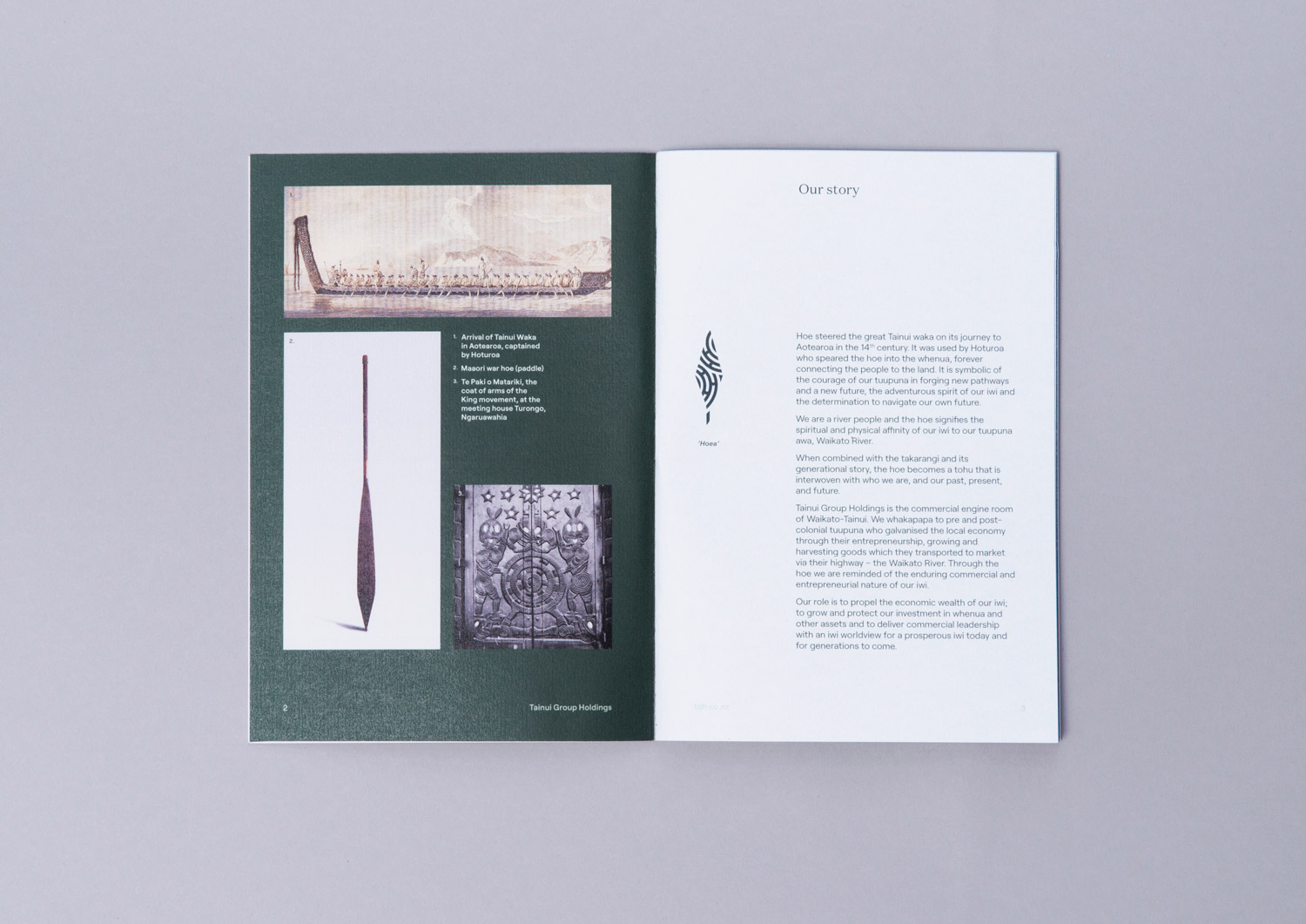
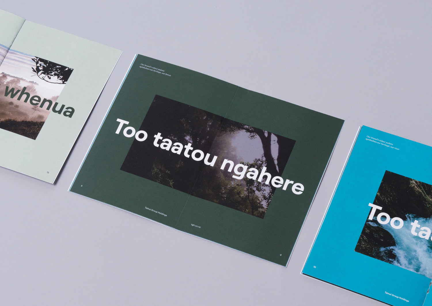
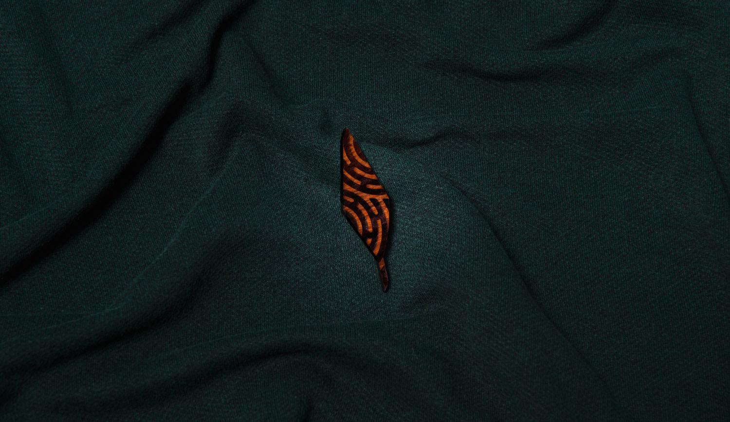
The colours of the new brand identity are inspired by nature; land, forest and water. The design of the logo mark itself was created by working closely with head carver of Tainui, Renata Te Wiata and cultural advisor Rewi Spraggon.
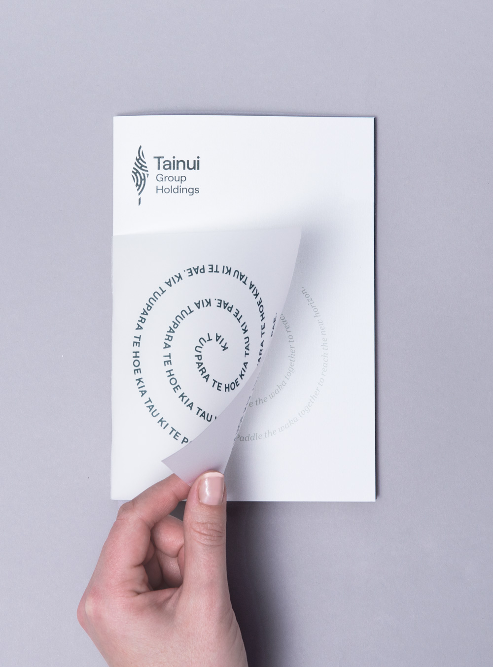
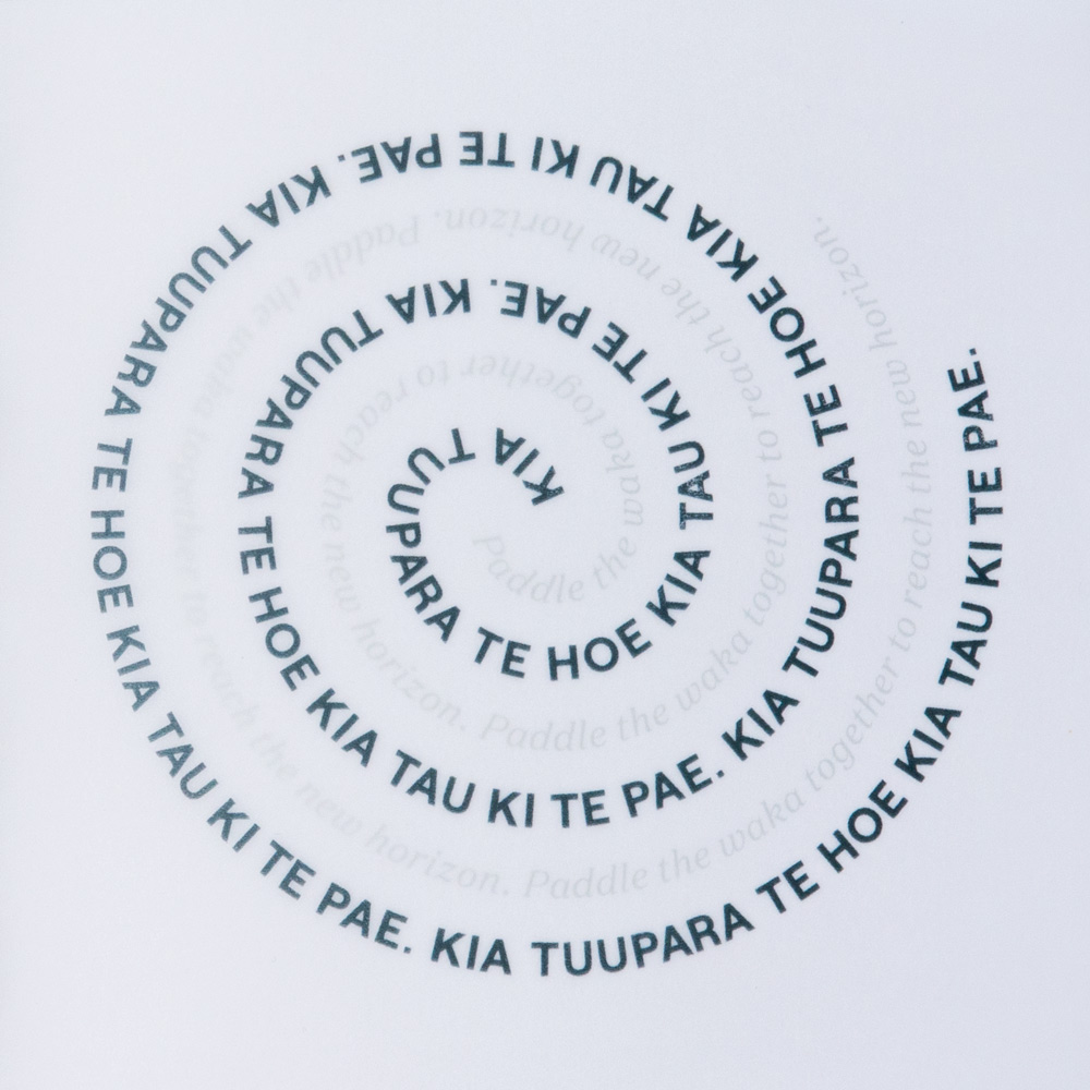
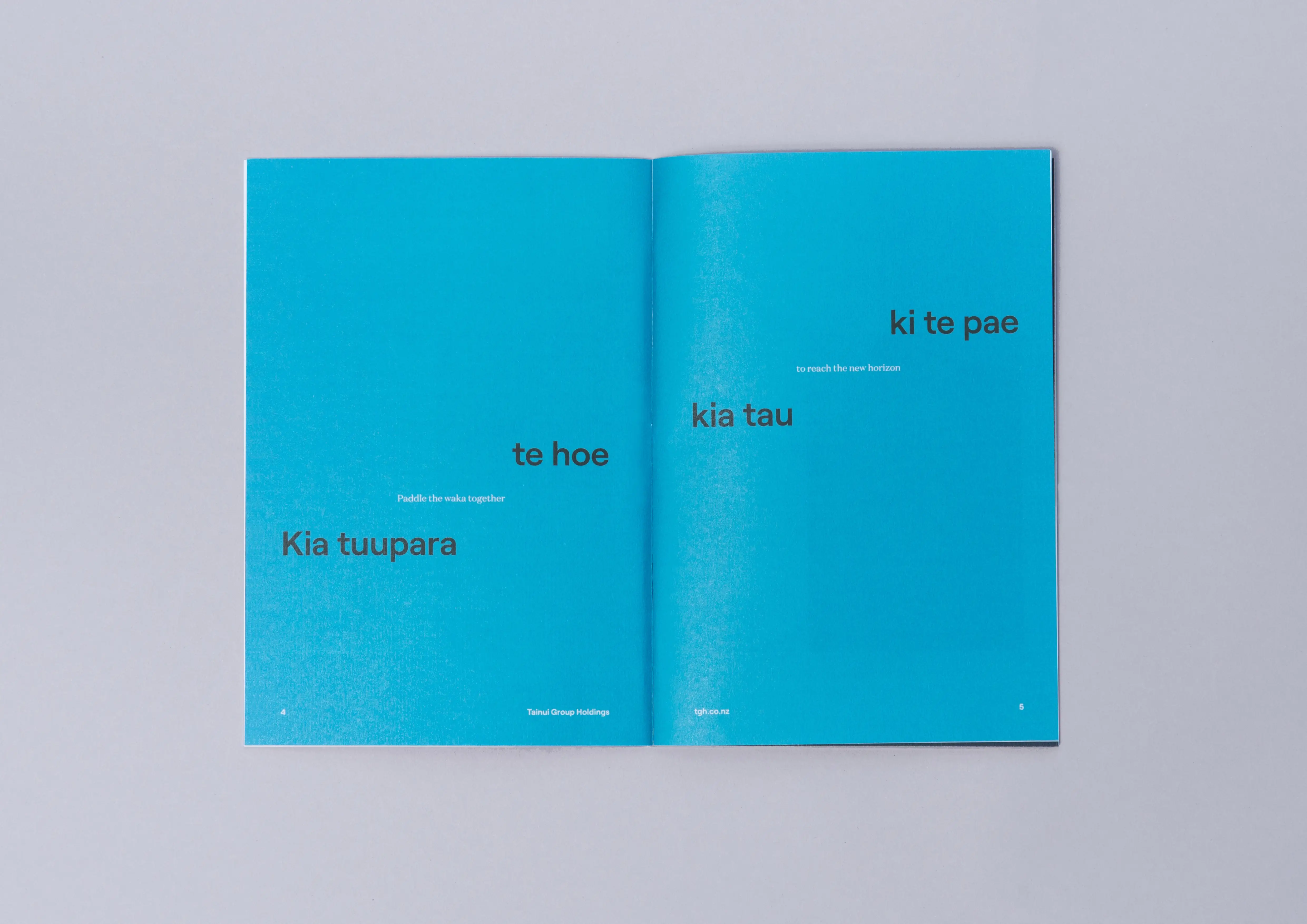
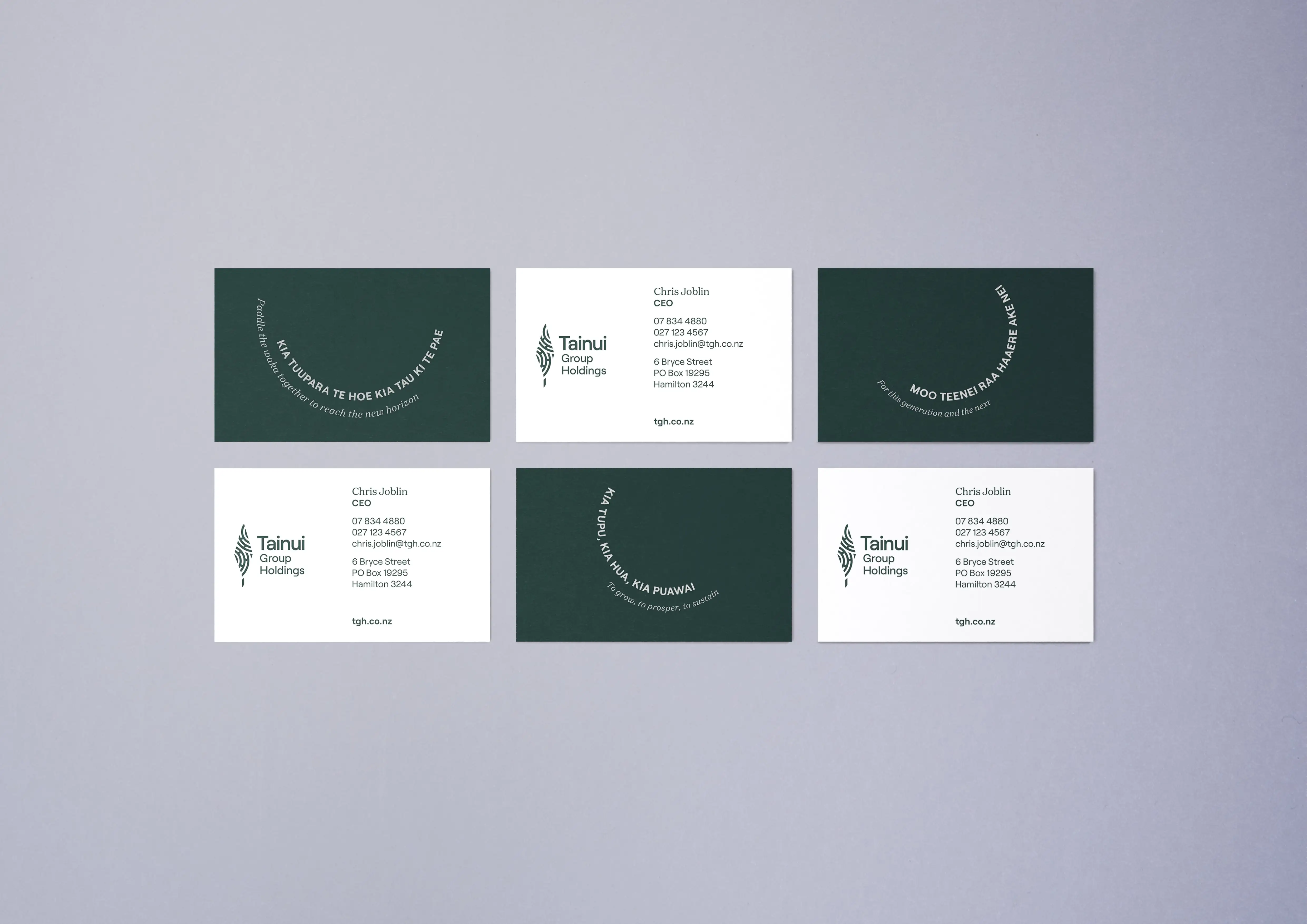
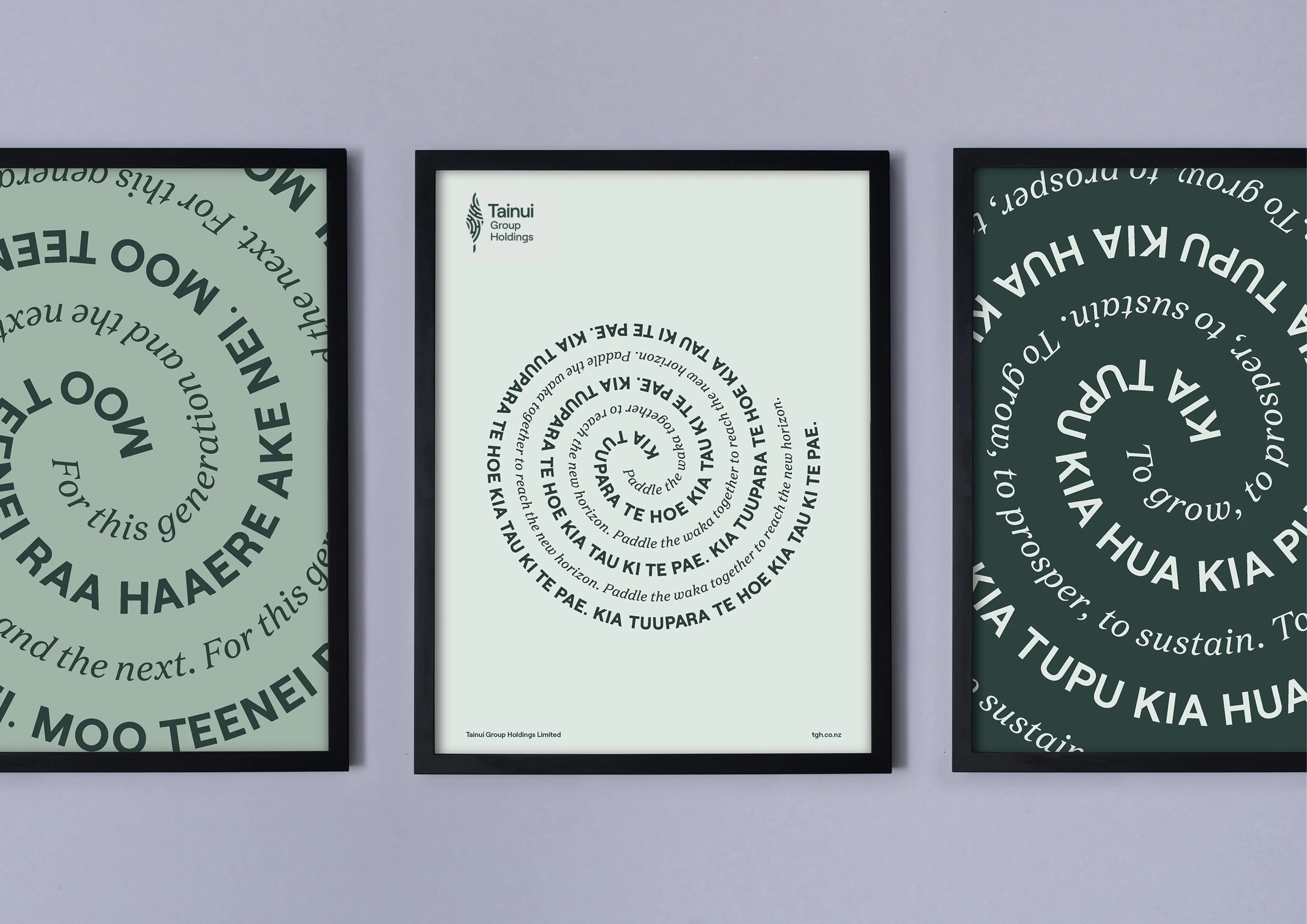
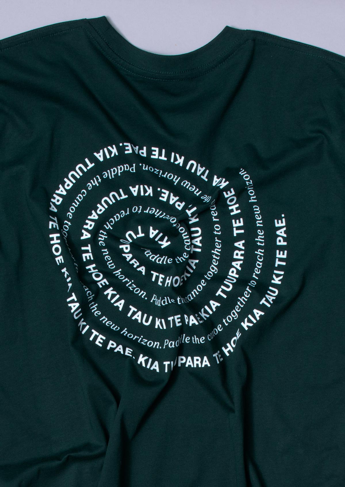
Iceberg also created a Takarangi-inspired circular text style to bring the words of Waikato Tainui kaumatua Rahui Papa to life. "Paddle the canoe together to reach the new horizon".

“As an iwi owned commercial entity our brand review required an approach that would ensure the end result was an authentic representation of who we are as Waikato iwi. To achieve that we needed a comprehensive and robust process to ensure iwi perspectives were heard, understood and adopted, and an agency that could apply this whakaaro in a commercial context. The brand that the Iceberg team, together with their cultural advisor Rewi Spraggon, have produced is unanimously endorsed by our iwi advisory roopu. It is outstanding.
—
Chris Joblin
CEO„